Research Projects

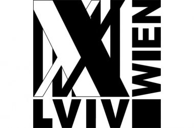
Lviv - Vienna Logo Design Competition, 2015

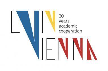
The Academic Cooperation between L‘vivska Polytechnic, institute of architecture and Vienna University of Technology, Faculty for Architecture and Planning has been going on for 20 years. In July 2015 a design competition was launched to create a logo for this cooperation.

The following criteria were essential to the logo-development:
The primary use of the logo will be it’s featuring on:this cooperation website, A4 letter paper, urbanistic project plans (A3 to A0). If the logo contains color information, it should also work as grayscale.

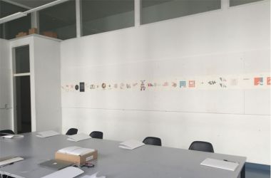
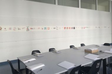
The first submission deadline of 31st of August 2015 was prolonged until September 14th 2015. In total 53 submissions were handed in, 32 of these from Lviv, 21 from Vienna.

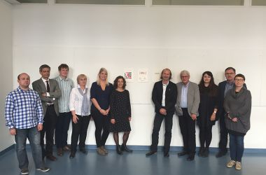
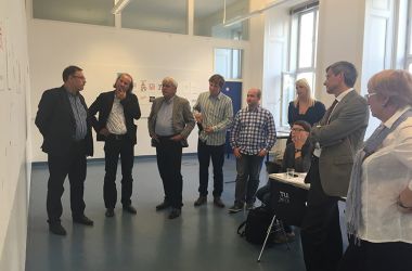
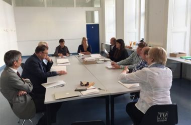
The jury consisted of consulting and of voting members. The members entitled to vote were three faculty members and one student from each university: Vienna University of Technology: Klaus Semsroth, Elisabeth Leitner, Andreas Hofer and Verena Wohlmacher; and L‘vivska Polytechnic: Bohdan Cherkes, Halyna Petryschyn, Anton Kolomyeytsev and Ivan Lipchey. Also one representative of the Federal Ministry of Science, Research and Economy (bmwfw) of Austria, Felix Wilcek, was entitled to vote. The external consultant (graphic & design), Inge Manka and moderator, Barbara Maschat had no voting right.

The jury met in Vienna the 21st of September 2015 to discuss the submissions in four rounds. Prof. Klaus Semsroth was elected head of the jury; research assistant Barbara Maschat prepared and moderated the meeting and handled the post-processing.

All works, with special attention given to the winning submissions, were presented at the 20-year celebrations November 19th, 2015 in Lviv and December 4th, 2015 in Vienna.

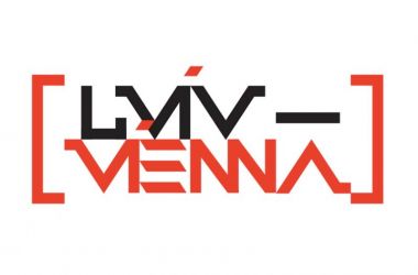
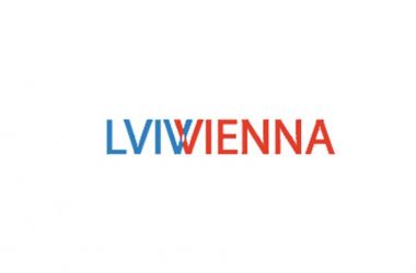
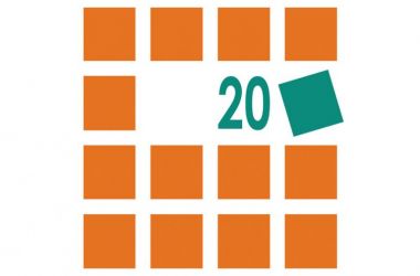
The first prize winner, Solomiya Hanets, PhD student and research assistant, National University L’vivska Polytechnic, received a travel voucher to the 20-year celebration in Vienna (worth 300€). Viktor Shtets, senior lecturer, National University L’vivska Polytechnic (2nd place) and Bernhard Mayer, master student and teaching assistant, Vienna University of Technology (3rd place), each received a recognition award in form of a 100€ book-voucher.

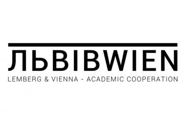
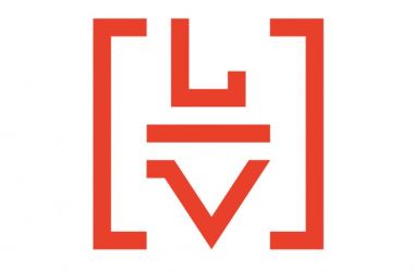
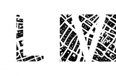
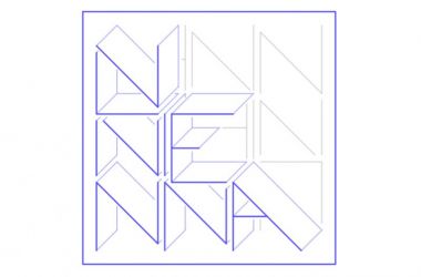
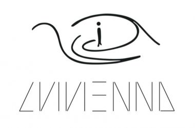
Below you will find the 10 best logos, each with the creators names and details, as well as a short description of their design.

Author:
Barbara Maschat

Jury:
Andreas Hofer
Anton Kolomeytsev
Elisabeth Leitner
Halyna Petryshyn
Christoph Ramoser
Klaus Semsroth
Bohdan Tscherkes

Logo Design Competition

SOLOMIYA HANETS
The logo is dominated by the two letters „XX“, referring to the 20 years of academic cooperation between Lviv Polytechnic and Vienna University of Technology. They also symbolize all the connections that have evolved from the cooperation. The stripes in the background refer to the columns of the similar university facades. The square between „Lviv“ and „Wien“ is a symbol for the great activities undertaken by the cooperation.

PhD student and research assistant

Lviv Polytechnic

VIKTOR SHTETS

At the core of this corporate typographical sign is the composition of the two words "Lviv" and "Vienna", symbolizing the dynamic relations between the two cities united by one vector of development.

senior lecturer

Lviv Polytechnic

BERNHARD MAYER

The logo shows the words ‚Lviv’ in cyrillic lettering and ‚Wien’ written in one line. The combination of the words depicts the collaboration of L'vivska Polytechnic and Vienna University of Technology. Although the universities have been working together closely for over twenty years, each university still has its own profile. Using each country’s particular language and letters symbolizes this. The line above the word-combination works as a kind of hyphen, which demonstrates that the bottom line is the cooperation of the universities.

master student and teaching assistant

TU Vienna

VIKTOR SHTETS

At the core of the logo is the typographical composition of the combination of the first letters of "Lviv" and "Vienna" enclosed in brackets, symbolizing the universities' cooperation.

senior lecturer

Lviv Polytechnic

MAX SANDNER

In the logo I tried to connect the two cities and also the topic of architecture. For me, the figure ground plan is a perfect symbol for urbanism and architecture. It gives an overview of a certain area and you can get a feeling for different spaces. Thus I took two main areas of the cities and put them into the letters L and V. It shows both the connection and the differences between the two cities. On one hand the letter is surrounded by the plan, on the other hand it is the plan itself.

bachelor student

TU Vienna

LUKAS VEJNIK

The logo makes use of the matching ending letter of „Lviv“/„Lwiw“ and beginning letter of „Vienna“/„Wien“. The interweaving of the letters represents the close collaboration of the two universities in Lviv and Vienna. The colors used are those of the two city arms.

master student

TU Vienna

FLORIAN SZEYWERTH

The typographic logo design emphasizes the connection of the two universities by the shape of the ’v’.
The blue ’v’ links the cities' names with the color of blue, one of the colors of the Ukrainian national flag and the corporate color of TU Wien. The color of yellow completes the Ukrainian flag and the red color stands for Vienna.
Moreover the ’v’ seen as the pointing tip of a vector represents the technical focus of both universities.
The ’v’ as the main symbol stands out whereas the completing shapes of the two cities' names can be seen in the background.

diplom student

TU Vienna

FLORIAN KIENESBERGER

The logo includes and links together the names of both university locations, Lviv and Vienna – “Lvivienna”.
The aim was, to design a logo that solely consists of the letters without any additional elements.
In the final design the letters compose a pattern that looks like a construction during its building process, the quintessence of architectural production and a symbol for a prosperous future of the collaboration.

bachelor student

TU Vienna

MARTIN NEUMÜLLER

The logo consists of two arrows which, combined with a human silhoutte, create an eye. At the same time, the arrows make up a „lambda“ for Lviv and a „V“ for Vienna. The rotary motion of the logo refers to the exchange between people but might also be interpreted as a river or a mountain, evoking an association with Alps, Danube, Vlatva and the Black Sea.
The lettering beneath this image draws on minimalist aesthetics but is also meant as a reference to the ukrainian railway – a wagon going in two directions at the same time.

bachelor student

TU Vienna

YULIYA IDAK

During the search for a design various options that would have been visually connected with the city, were reviewed. My goal was to make the image interesting, concise and content revealing. 
The square - the most urban form in terms of association and best undergoes transformation in terms of composition was taken for the basis. 
On the other hand, each element of the composition is a goal that was achieved in the cooperation process. As far as, collaboration is a process that does not end on this, I added dynamics by flipping one of the elements.

docent

Lviv Polytechnic